Toned Ground Painting: Why Artists Don't Start on White
Toned ground painting explained: why a white canvas distorts your value judgements, what colour and value to tone with, and how to tone a canvas.
Walk into an atelier and you will see very little work being started on brilliant white. The canvases are washed with a thin brown or grey, and the drawings are on tan or blue paper. That is not tradition for its own sake. A white ground actively lies to you about the values you are putting down, and toning the surface removes the lie before you make a single decision.
What a toned ground is
A toned ground is a thin, even layer of colour laid over your white primer, dried, and then painted on top of. In oils it is usually a wash of pigment thinned with solvent, wiped down with a rag so the weave still shows. In acrylics it is a diluted coat. On paper you skip the step entirely and buy paper that is already a mid tone.
You will also see the word imprimatura, which is the same idea by its older Italian name: a transparent tone over the white ground. Strictly, the ground is the primer and the imprimatura is the tone on top of it, but in ordinary studio talk “toned ground” covers both.
Why a white canvas distorts your values
This is the real argument, and it is worth understanding rather than taking on faith.
Any patch of paint looks lighter or darker depending on what surrounds it. Put a mid grey next to white and it looks dark; put the same grey next to black and it looks light. That effect is called simultaneous contrast, and a blank white canvas is the most extreme surround you can possibly work against.
Now follow what that does to a painting session. Every stroke you put on the white looks darker than it really is, so you correct by mixing lighter. You do it again with the next stroke, and the next. By the time the canvas is covered there is nothing left to compare against, the bias disappears, and you are looking at a picture that has drifted pale and chalky all over. The mistake was made in the first hour, on a surface that was misleading you.
A ground at a middle value removes that. Your first mark can be judged against a tone that is already in the range you are working in.
Working in two directions from a middle tone
On white there is only one direction to travel. Every mark is a step darker than the surface.
Start from a middle tone and you can work in both directions: darks into the shadow, lights pulled up out of it, and the ground itself left showing as your halftone. That is not just efficient, it is how you keep a drawing unified, because a shared tone runs underneath everything and ties the picture together.
The clearest demonstration is a chalk drawing on toned paper.
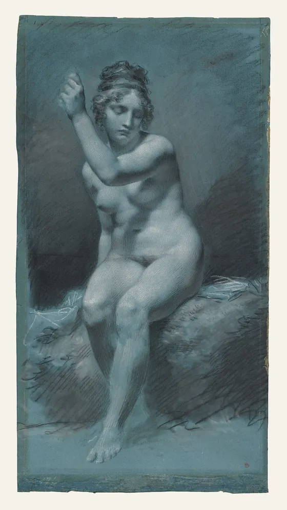
Look at how little of that sheet is actually drawn on. The lit planes are white chalk, the shadows are black chalk, and everything in between is bare paper. The ground is not a background. It is a working value.
What colour to tone a canvas with
There is no single correct answer, but the choices cluster, and each does a different job.
Raw umber. The workhorse. A quiet, slightly cool brown that dries fast, sits at a useful middle value, and flatters almost anything. If you are unsure, start here.
Burnt sienna or a warm earth. Warmer and more saturated. Wonderful under a portrait, because any cool grey you lay over it reads as luminous by contrast, and any scrap of ground left showing in the shadows behaves like reflected warmth.
Neutral grey. The most honest choice, because it interferes least with your colour judgements. The trade-off is that it can feel inert and gives you nothing back.
Terre verte or a muted green. The traditional choice under flesh, going back to the verdaccio underpainting of early Italian panels. Green sits opposite red on the colour wheel, so warm flesh laid over it looks warmer still.
Cool grey or grey-blue. Good for a cool, high-key subject, and the reason blue paper works so well for chalk drawing.
One principle covers all of them: tone against your subject, not out of habit. If the picture is going to be dominated by warm flesh, a cool or green ground will make it sing. If it is a cool grey day, a warm ground will keep it from going dead.
What value to tone to
Aim for the middle, then a touch darker.
A ground somewhere around the middle of your value range gives you the most room in both directions. Many painters go slightly darker than the middle, because it is easier to pull lights up out of a tone than to push darks down into one, and because a slightly dark ground makes you commit to genuinely dark darks.
What you want to avoid is either extreme. Too light and you are back to the white canvas problem in a milder form. Too dark and everything you put on looks too light, so you overcorrect the other way, your darks lose their bite, and the picture ends up muddy and heavy.
How to tone a canvas
For oils, working over a dried white primer:
- Squeeze out a little raw umber and thin it heavily with solvent, to the consistency of tea.
- Scrub it over the whole surface with a rag or a big soft brush. Do not be precious about it.
- Wipe it back with a clean rag until you have an even, transparent film and the texture of the weave shows through.
- Let it dry completely. A thin umber wash is usually touch dry in a day. Painting into a wet ground drags it up into your mixtures and greys everything.
Two things worth knowing. Keep it thin, because a heavy, oily ground can cause adhesion problems later. And keep it transparent if you want any luminosity from the white primer underneath; an opaque ground kills that permanently.
For acrylics, the same but with water, and you can paint over it within the hour. For a drawing, just buy toned paper.
When a white ground is still right
Toning is not a universal law, and a good teacher will tell you when to skip it.
- Watercolour. The paper is your light source. Toning it throws away the whole point.
- High-key, luminous work. Colour glazed over a brilliant white ground has a glow you cannot get any other way. This is exactly what the Pre-Raphaelites were after, and what Turner exploited when he worked over a white ground.
- When you want maximum value range. A white ground gives you the widest possible span between your lightest and darkest note.
- Learning to judge values cold. There is an argument for spending some time on white precisely so you learn to compensate, rather than relying on the ground to do it for you.
The honest summary: a toned ground is a tool for keeping your value judgements accurate and your picture unified. If those are your problems, it will fix them. If your problem is luminosity, it may be the wrong tool.
Common toned ground mistakes
- Painting into a wet ground. Everything you mix picks up the tone and the whole picture greys down. Let it dry.
- Toning too dark. The most frequent overcorrection. You lose your darks and the painting turns muddy.
- Laying it on too thick. A toned ground should be a stain, not a layer of paint.
- Choosing the colour out of habit. A warm ground under a warm subject leaves you nothing to push against.
- Covering it completely. Some of the best passages in a painting on a toned ground are the places where the ground is still showing.
The reason a toned ground works is that value is relative, so it helps to see that relativity directly. In Art Atelier you can light a 3D planar head from any angle and posterize the shading into a few flat value steps, which gives you a value answer that does not shift with whatever surrounds it.
Related: Simultaneous contrast for the effect that makes a white canvas mislead you, and how to see values like an atelier student for the squinting, value scale and notan habits that go with it.
Practise this in Art Atelier
Orbit a studio light around a 3D planar head, snap to classic presets, and posterize the values into a notan. Free on iOS & Android.
Download the app