How to See Values Like an Atelier Student
A complete guide to value in drawing and painting: how to see it, the value scale, notan studies, the light and shadow families, and choosing a value key.
Ask an atelier teacher why a beginner’s drawing looks flat, and the answer is almost always the same: the values are off. Value is how light or dark something is, ignoring its colour. It is the single most important tool for making a drawing or painting look solid and three-dimensional. Get the values right and a picture reads even in black and white. Get them wrong and no amount of detail or nice colour will save it.
The good news is that seeing value is a skill you can train. This guide covers the habits ateliers use to train it, starting with squinting, the value scale and notan studies, then the light and shadow families, choosing a value key, and controlling your edges.
What “value” actually means
Value is just lightness or darkness. A lemon and a banana are different colours, but in bright light they can be almost the same value. A white shirt in shadow can be darker than a black shirt in sunlight. This trips up beginners constantly, because our brains care about colour and about what an object “is”, while a picture only cares about how light or dark each patch appears.
Learning value means learning to switch off that naming instinct and judge each area by lightness alone.
Local value and the value you actually see
Two different things get called “value” and confusing them causes a lot of trouble.
Local value is how light or dark a thing is in itself, ignoring the light on it. White paint has a light local value. A black cat has a dark one. It does not change when you move the lamp.
The value you see is what that surface actually looks like right now, under this light, from where you are standing. It changes constantly.
A picture only ever records the second one. This is why a white shirt in shadow can be painted darker than a black shirt in sunlight, and the picture still reads as a white shirt and a black shirt. Beginners paint the local value instead, because they are painting what they know rather than what is in front of them. Whites come out too light everywhere, darks too dark everywhere, and the light in the picture goes flat.
The fix is a habit rather than a technique. Before you commit any tone, ask which of the two you are about to paint.
Squinting: the oldest trick in the studio
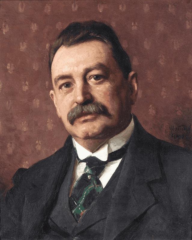
Squinting is the fastest way to see value clearly, and every atelier uses it. When you narrow your eyes until they are almost closed, two useful things happen:
- Detail disappears. Pores, hairs, and texture drop away, so you are left with big simple shapes.
- Values clump together. The many small tones merge into a few large ones, which makes the main light and shadow shapes obvious.
Try it now on anything nearby. Squint at a mug on a desk and watch it collapse into a bright shape, a mid-tone shape, and a dark shape. That simplified version is what you want to draw first. Beginners tend to draw every tone they can see with wide-open eyes, which is why their work looks busy and flat. Squinting forces you to commit to the big shapes.
The value scale
A value scale is a strip that runs from black to white in even steps. Most ateliers use a scale of about nine steps, or a simpler five for quick work. It gives you a shared language, so instead of saying “sort of dark” you can say “that is a value 3”.
Two ideas make the scale useful:
- Fewer steps than you think. A whole drawing can be built from four or five values. If you try to use all nine plus everything in between, you lose the clear structure.
- Judge by comparison, not in isolation. No patch has a value on its own. You decide it is a 3 because it is darker than the 5 next to it and lighter than the 2 below it. Always compare one area against another rather than staring at a single spot.
A handy check: hold a real value scale up next to your subject, or make one small hole in a grey card and look at each part of your subject through it. Isolating a patch this way stops your brain from being fooled by the colours and edges around it. That fooling has a name, simultaneous contrast, and it is worth understanding properly because it is behind most value mistakes.
The two families: light and shadow
Squinting gives you shapes. The next step is to sort them, and ateliers sort them into just two groups.
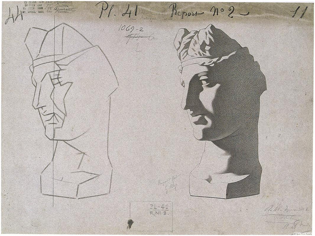
Every part of your subject is either in the light or in the shadow. Light family: everything the light source actually reaches, including the pale halftones where a surface turns gently away. Shadow family: everything it does not reach, including the faint lifts inside the shadow where light has bounced back in.
The line between them is not a matter of taste. It falls exactly where the surface turns far enough that the light stops landing on it, and that boundary has a name, the terminator. On a rounded form it is soft and hard to find. On a faceted form like a planar head it sits on an edge you can point to.
Sorting into families first matters because it gives you a structure that holds. Decide which family every area belongs to, put those two masses down, and only then work inside each one. The alternative, judging each small patch against its neighbours as you go, is how pictures drift.
One rule protects the structure once you have it: the two families must not swap places. Nothing in the shadow should climb into the range of the lights, which in practice means being disciplined about reflected light in shadow.
Notan: studying value as flat shapes
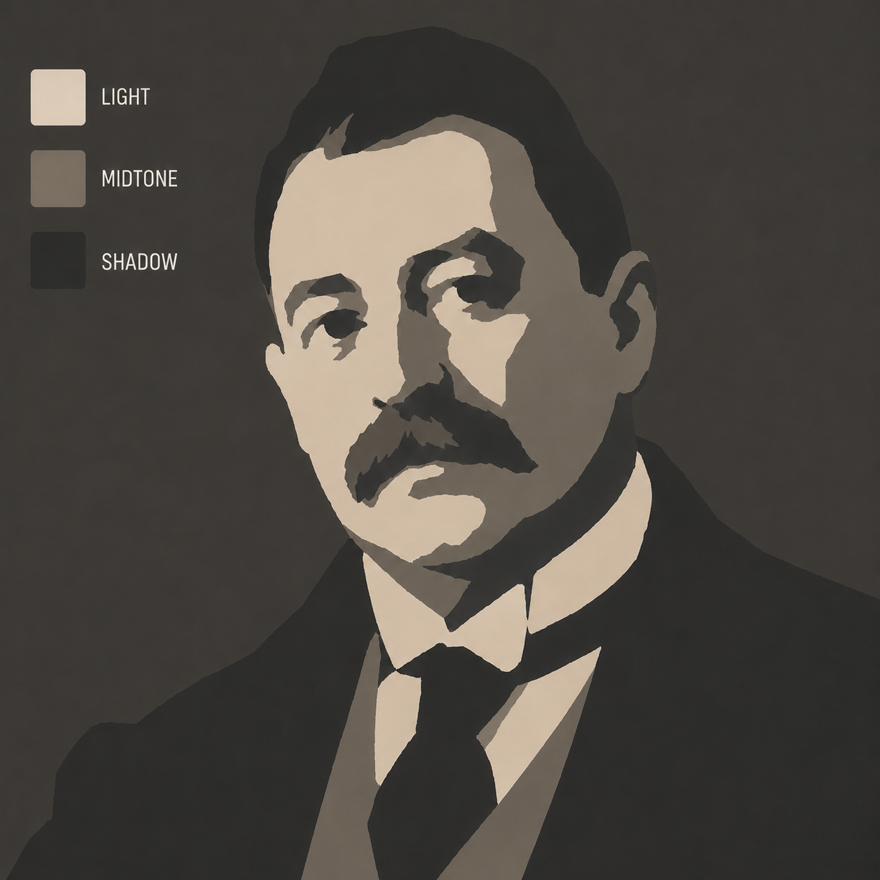
Notan is a Japanese idea about the balance of light and dark. In practice, a notan study is a drawing where you use only a few flat values and no blending. It is the purest way to practise value, because it removes colour, detail, and soft edges, and leaves only the shapes.
Start with two values.
- Two-value notan. Pure black and pure white, nothing in between. Squint at your subject and decide, for every area, is this in the light family or the shadow family? Fill the shadow shapes solid black and leave the light shapes white. This one exercise teaches you more about reading light than hours of careful shading.
- Three-value notan. Now add a mid grey. Light, halftone, and shadow. This is enough to describe most subjects convincingly and is the workhorse of atelier value study.
- Four or five values. Once three feels easy, add a step or two for a bit more subtlety. Rarely do you need more.
The rule that ties it together: block in the big value shapes first, keep them flat, and only soften edges at the very end. Structure before finish, every time.
Value key: how many values, and where they sit
A notan tells you how many values you are using. Your key tells you where in the range they sit.
A low key picture lives in the dark steps, with the lights used sparingly. A high key picture lives in the light steps and may never use a true black. A full range picture uses both ends.
None of these is better. What matters is that you pick one and hold it, because the most common failure in a beginner’s work is having no key at all: a few timid darks, a few timid lights, and everything else piling up in the middle where it cancels out.
Two practical notes. Decide your key from the subject and the mood before your first mark, not halfway through. And whatever key you choose, keep your extremes rare. If your darkest dark and your lightest light both appear all over the picture, neither of them means anything any more.
Edges: where one value meets the next
Value is not just how light or dark an area is. It is also how quickly it changes into the next one, and beginners almost always get this wrong in the same direction: everything gets blended.
Three kinds of edge do most of the work.
- Hard. An abrupt change. Cast shadows, the meeting of two different objects, a crisp shadow on a bony form like the brow.
- Soft. A gradual change. The terminator on a rounded form, a cheek turning away from the light.
- Lost. No visible change at all, because two areas share the same value and merge into one shape. This is a tool, not a mistake. Losing an edge into a background is how you keep a picture from looking cut out.
Rembrandt does all three in one head.
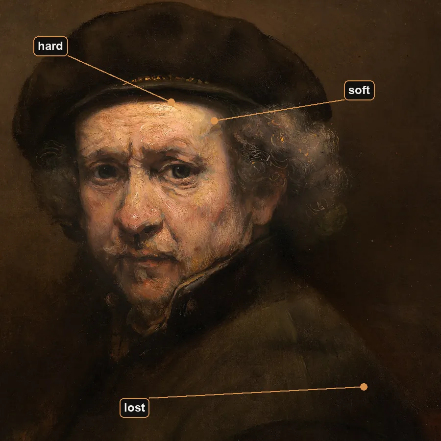
Measure those first two and the surprise is that they cover almost the same amount of value. The hard one just spends a fraction of the distance doing it. That is the whole of edge control: not how much the value changes, but how far you give it to change in.
The order matters more than the vocabulary: get the flat value shapes right first, then decide what each edge does. That working order is not just an edges rule, it is the structure of a classical drawing from start to finish. Softening early feels like progress and is really a way of hiding a value structure that has not been settled. If a passage will not read, the problem is almost never the edge. It is the value on one side of it.
The words you will hear
Atelier teaching has its own vocabulary, and most of it is just names for things you have already seen in this guide.
- Local value. How light or dark something is in itself, before any light falls on it.
- Halftone. A surface still catching the light but turned away from it at a slant. Part of the light family, not the shadow.
- Terminator. The boundary where the light stops reaching the surface. Everything past it is shadow.
- Form shadow. The part of the object turned away from the light. Your darkest note on the object usually sits here.
- Cast shadow. The shadow the object throws onto something else. Not on the object at all.
- Reflected light. A faint lift inside the shadow where light has bounced back in off something nearby.
- Notan. A study using only a few flat values and no blending.
- Key. Where in the range a picture sits, from low key to high key.
- Imprimatura. A thin transparent tone laid over a white ground before you start, the same idea as a toned ground.
If a teacher uses a word you do not know, it is almost always one of these.
A simple practice routine
You can build a real eye for value in short daily sessions.
- Pick a strong subject. Anything under a single clear light works best. A face, a mug, an apple.
- Squint and find the shadow shape. Draw the outline of the shadow as one flat shape and fill it. That is your two-value notan.
- Add a halftone. Put in the mid grey where planes turn gently away from the light. Now you have three values.
- Check against a scale. Compare your darks and lights to a value scale. Are your shadows actually dark enough? Beginners almost always make shadows too light and timid.
- Repeat with new light. Move the light or pick a new subject and do it again. Speed and confidence come from repetition.
Common beginner mistakes
- Weak shadows. The most common problem by far. Commit to genuinely dark darks. Half-hearted greys make everything look foggy, and the usual culprit is reflected light painted too bright.
- Too many values. If every area is a slightly different tone, nothing reads. Group them into a few families.
- Trusting colour over value. A bright colour is not always a light value. Squint and judge lightness on its own.
- Blending too soon. Soft edges hide a weak value structure instead of fixing it. Get the flat shapes right first.
- Painting local value instead of what you see. Whites too light, darks too dark, and the light in the picture goes flat.
- No key at all. Timid darks, timid lights, and everything crowded into the middle of the scale.
The quickest way to train your eye is to compare your own value calls against a clean reference. In Art Atelier you light a 3D head however you like, then switch on value steps to collapse the shading into 2 to 5 flat tones, exactly like a notan. Try guessing the shadow shape yourself first, then turn on value steps to check.
Related: The planar head, explained, on how the planes of the face decide where those values fall. Then simultaneous contrast for why your eye misjudges value, toned ground painting for the surface to judge it against, and reflected light in shadow for the rule that keeps form solid.
Practise this in Art Atelier
Orbit a studio light around a 3D planar head, snap to classic presets, and posterize the values into a notan. Free on iOS & Android.
Download the app