Simultaneous Contrast: Why the Same Value Looks Different
Simultaneous contrast explained for artists: why the same grey looks lighter or darker depending on what surrounds it, and how to use it in your painting.
Two squares on a checkerboard can be printed with exactly the same grey ink and still look nothing alike. That is simultaneous contrast, and every artist runs into it, usually without knowing that is what went wrong. Your shadows come out too pale, your highlights refuse to glow, your carefully mixed grey turns blue the moment it lands next to an orange.
What simultaneous contrast is
Simultaneous contrast is the effect where a value or colour looks different depending on what surrounds it. A grey patch looks light on a dark ground and dark on a light ground, though the patch itself has not changed at all.
The name comes from Michel Eugène Chevreul, a French chemist who published the law of simultaneous contrast in 1839. He was working at the Gobelins tapestry works, where the dyers kept being blamed for weak black yarn. The blacks were fine. The neighbouring colours were doing the damage.
Understanding this one effect changes how you mix, how you compare, and how you judge a picture. It is also the reason ateliers teach you to judge value by comparison rather than by staring at a single spot.
Albers’ two squares: one colour appearing as two
Here is the demonstration Josef Albers taught in Interaction of Color: two identical grey squares, one on a dark ground and one on a light ground.
Cover the surrounds with your fingers and the two squares snap back together. Nothing about the paint changed. Only the neighbours did.
Adelson’s checker shadow illusion
The strongest version of the effect is Edward Adelson’s checker shadow illusion, published in 1995. A green cylinder casts a shadow across a checkerboard. Square A sits in the light part of the board and looks like a dark grey square. Square B sits inside the shadow and looks like a light grey square.
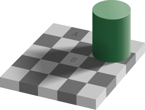
They are the same value. Not close, identical. Here is the proof: a bar of that exact grey is drawn connecting the two squares, so you can follow one continuous tone from A to B.
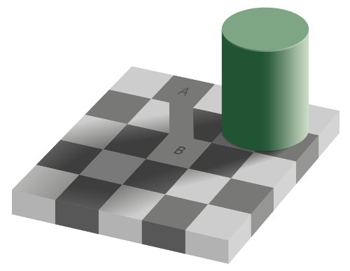
Cover everything except the two squares and they merge. Uncover the board and they split apart again. Knowing the answer does not help. You cannot decide to see it correctly, which is exactly why this matters at the easel.
Strictly speaking the checkerboard is doing more than simple contrast. Two things push A and B apart. A is ringed by lighter checks and B by darker ones, so plain contrast separates them before anything else happens. On top of that, your visual system is discounting the illuminant. It works out that B lies under a shadow and corrects for it, so it concludes that B must be a pale square being dimmed. A sits in full light, so A must be a genuinely dark square. It is the same mechanism that lets you recognise a white shirt as white both indoors and outdoors. Both readings are useful in a real room and both are wrong on a flat page. The lesson holds either way: your eye reports relationships, not measurements.
Why your eye does this: lateral inhibition and interpretation
There are two things going on, and they stack.
Lateral inhibition. Cells in your retina are wired in little centre-and-surround units. When light hits the centre of one, it fires; when light hits its surround, it fires less. The effect is a built-in edge detector that exaggerates differences across a boundary. A grey next to a dark neighbour gets pushed lighter. The same grey next to a light neighbour gets pushed darker.
Interpretation. On top of that raw signal, your brain runs a constant guessing game about what it is looking at. Is that patch a dark surface in bright light, or a pale surface in shadow? It commits to an answer, and you see the answer, not the data.
Both are useful for walking around the world and terrible for judging a picture. The camera in your phone measures light. You do not.
Simultaneous contrast and successive contrast
The two get confused. Simultaneous contrast happens when two areas are seen at the same time and each pushes the appearance of the other. Successive contrast happens over time: stare at a red shape, look away at white paper, and you see a green afterimage. Both come from the same adaptive machinery, but simultaneous contrast is the one changing the picture in front of you right now.
How to use simultaneous contrast in your painting
This is where the effect stops being a party trick and becomes a working method.
1. Never judge a value in isolation
There is no such thing as the correct value for a shadow. There is only its value relative to the light beside it, the halftone above it, and the background behind it. When you mix a tone on the palette and it looks right, that means nothing. It only counts once it is next to its neighbours on the canvas. Mix, place, then judge.
This is why atelier students are drilled on comparison. Not “how dark is this?” but “is this darker or lighter than that, and by how much?“
2. Work on a toned ground
A white canvas is the worst possible surround. Everything you place on it looks darker than it is, so you keep lightening, and the whole picture drifts pale and chalky. Toning the surface to a middle value removes the bias, and the same logic applies to drawing on grey or tan paper. There is more on choosing the colour and value in toned ground painting.
3. Make lights glow by darkening what is around them
Your lightest paint is white, and white is not very bright. You cannot out-paint the sun. What you can do is control the surround, because apparent brightness is relative. Turner and Vermeer both get their light effects this way: the glow is manufactured by the depth of tone beside the light, not by extra white.
So ration your extremes. If your darkest dark and your lightest light sit together, that point becomes the loudest part of the picture. Put that meeting at your focal point on purpose, and keep the contrast lower everywhere else.
4. Keep reflected light inside the shadow family
Reflected light bouncing into a shadow looks bright, because it is surrounded by dark. So you paint it bright, and suddenly the shadow side of the face has a glowing patch that fights the light side and the head falls apart. The atelier rule: every value in the shadow family stays darker than every value in the light family. Reflected light is the lightest note in the shadow, not a rival light source. Squint and it should disappear into the shadow mass. The full version of this, with the anatomy of a shadow laid out, is in reflected light in shadow.
5. Group into two families first
The effect is worst when you are comparing lots of small adjacent patches, because each one is distorting the others. Decide the big divisions first, then work inside them. This is what a notan study is for.
6. Check your values with a camera, not your eye
When you genuinely cannot tell, take the surround out of the decision. Photograph your painting next to the subject and desaturate it on your phone, because the camera has no opinion. Or look at the whole thing in a mirror, so you stop reading it as objects and start seeing it as tones. The older studio methods, a hole punched in a grey card or a value scale held right against the subject, are in the value guide.
In Art Atelier you can light a 3D planar head and posterize the shading into flat value steps, which gives you an unfoolable second opinion on a subject you control.
7. Simultaneous contrast in colour, not just value
Everything above applies to hue and saturation. A neutral grey surrounded by red drifts green. A muted olive looks positively vivid next to a true grey and dead next to a saturated green.
Two practical uses. First, you can make a colour look more saturated by surrounding it with its complement rather than by reaching for a brighter pigment. Second, a grey mixed in isolation on the palette will almost never stay neutral in the painting, so mix your greys against the colours they will sit beside.
Simultaneous contrast in famous paintings
Painters have been exploiting this for four hundred years, and one of them was working straight from a published law.
Seurat, Bathers at Asnières (1884)
The clearest case in Western painting. Seurat had read Chevreul, and he applied the law deliberately.
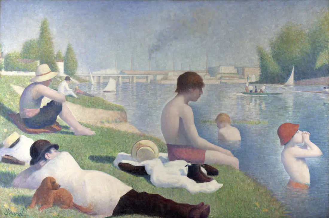
Look along the sunlit back of that seated boy. The river immediately behind his contour is distinctly darker than the same water a little further out, a narrow dark halo hugging the lit edge. The difference is big enough to measure, so it is not just an impression. The water is not doing that in nature. Seurat put it there so a lit form would sit in air.
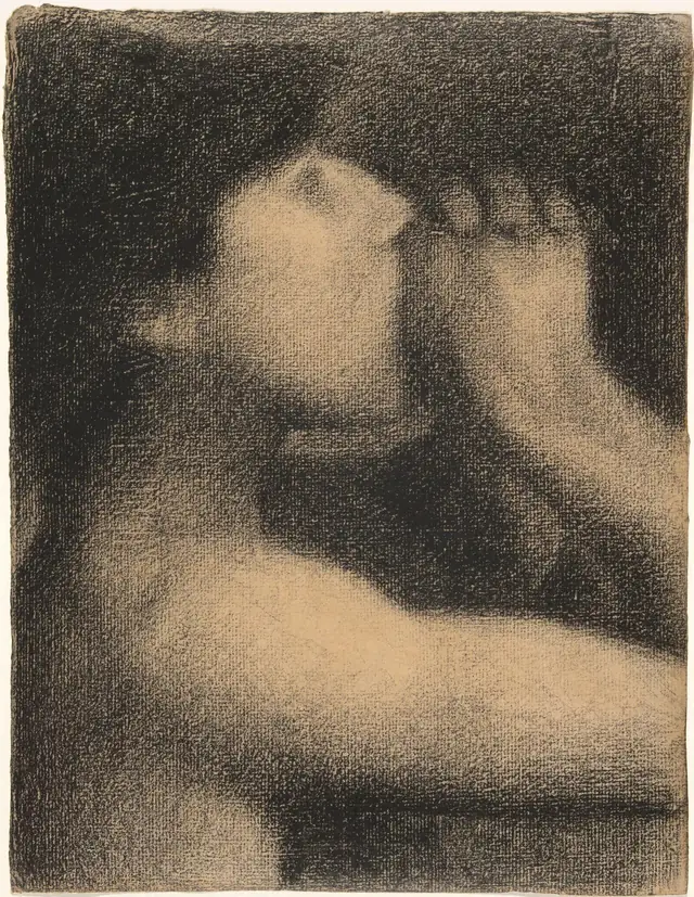
He called the effect irradiation, and his conté crayon drawings push it hardest of all. Dense black in the figure, then feathery and light in the background right where it meets the figure, so a faint halo surrounds every form. There are no outlines anywhere. The figures separate from the ground purely by engineered contrast.
Vermeer, Girl with a Pearl Earring (c. 1665)
The famous pearl is barely painted at all. There is one bright dab at the upper left, a soft grey touch along the lower edge where light bounces up off her collar, and between the two nothing but the shadow of her neck. No outline, no modelled sphere.
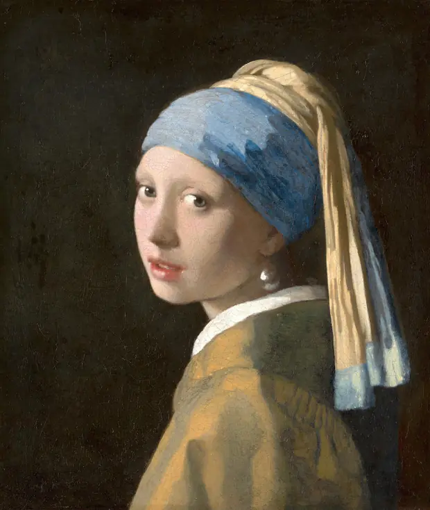
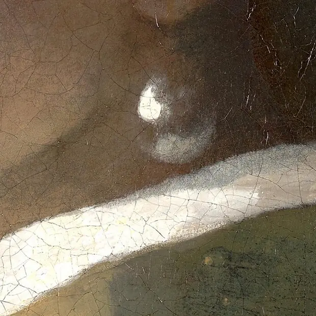
Check the dark middle of that pearl against her lit cheek and they come out the same. You see a round, glowing pearl anyway. Vermeer gives you two strokes and a dark surround. Your eye invents the sphere.
Caravaggio, The Calling of Saint Matthew (1600)
This one you can check for yourself. Two spots are marked below, and under each is a grey square mixed to exactly the same lightness as the paint at that spot.
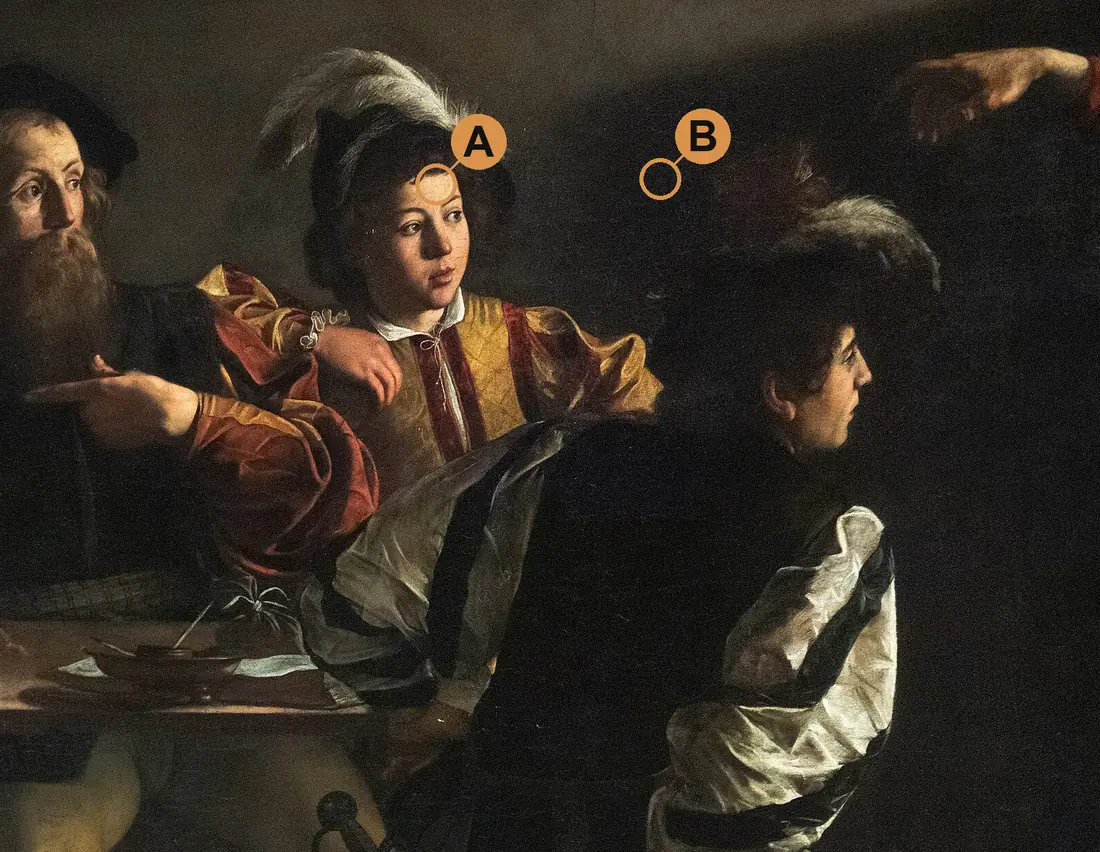
The light on that forehead is not white. It is a warm cream, closer to a pale orange than to white, and it stops short of white paper. Nothing in this painting reaches white, not even the boy’s linen shirt, which is the brightest thing in it. You read that forehead as blazing daylight anyway.
More useful still: Caravaggio is not brilliant because his lights are bright. He is brilliant because they are rare. Roughly four fifths of this picture sits in the dark, with very little in the middle of the range. He saves all the light for a few square inches of face and linen, then puts it straight against the dark with no transition. The blaze is paid for by everything else giving up its brightness.
Guess how much of a painting like this is genuinely dark before you measure it. People routinely underestimate it by half. For one passage to glow, the rest of the picture has to be darker and plainer than you want it to be. Ateliers set a plaster cast against a dark backdrop for exactly this reason.
Whistler, Nocturne in Black and Gold: The Falling Rocket (1875)
The opposite lesson. Whistler holds the whole picture inside one narrow band of dark values, so his few sparks of gold have nothing to compete with and read as fire. Within that band the eye rescales, and differences too small to register anywhere else start reading as significant.
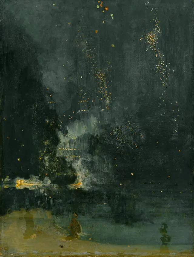
This is why a low-contrast painting can still feel full of light: contrast is judged relative to the range you establish, not against an absolute.
Value mistakes simultaneous contrast explains
- Shadows that end up too light. Judged against a white canvas, where everything looks dark by comparison.
- Highlights that will not sing. The surround is not dark enough to let them read as light.
- Backgrounds that fight the subject. A background changes every value in the picture, so establish it early rather than filling it in at the end.
Related: How to see values like an atelier student for the squinting and notan habits, and the planar head explained for why the values fall where they do.
Practise this in Art Atelier
Orbit a studio light around a 3D planar head, snap to classic presets, and posterize the values into a notan. Free on iOS & Android.
Download the app